Bringing sprayed edges to nonfiction – because serious books can be stunning too.
Fiction’s sprayed edge trend is leaving nonfiction behind, despite decorated book edges having centuries of history. Adding these artistic “spredges” to educational books could boost visibility, collectability, and engagement with informational content – transforming how we perceive serious literature.
Key Takeaways:
- Sprayed edges (spredges) have been transforming fiction books into collectible art pieces but are rarely seen on nonfiction titles;
- Decorated book edges have a rich history dating back to the 10th century as a form of book art;
- Adding spredges to nonfiction could increase visibility, marketability, and reader engagement with informational content;
- Harvey Publishing is examining innovative ways to enhance the visual appeal of educational and informative books;
- Strategic use of spredges in nonfiction could change how we perceive and interact with educational content.
The Aesthetic Gap: Why Nonfiction Books Are Missing Out on Spredges:
Walk into any modern bookstore and you’ll notice an unmistakable trend: fiction books with edges that sparkle, shimmer, and showcase intricate designs while nonfiction titles sit nearby with plain, unadorned pages. This aesthetic divide isn’t just noticeable, it’s a missed opportunity for publishers and readers alike.
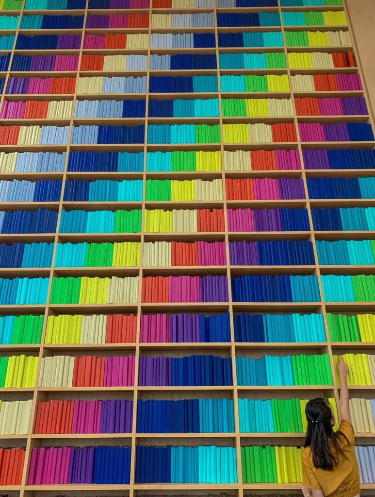
The art of decorating book edges – affectionately known as ‘spredges’ in the publishing world – has experienced a renaissance in recent years.
Harvey Publishing has been monitoring this trend, recognising that beautiful books create deeper connections with readers in our visually driven culture.
But why should fiction have all the fun? The stark visual difference between fiction and nonfiction sections reflects an outdated assumption: that serious content doesn’t deserve beautiful presentation.
From Ancient Fore-Edge Painting to Modern Spredges:
Book edge decoration isn’t a modern invention – it’s an art form with roots stretching back to the 10th century. Originally known as fore-edge painting, this technique involved painting scenes on the edges of book pages that would only become visible when the pages were fanned. These early decorated edges weren’t just decorative flourishes; they represented the book as a complete artistic object worthy of craftsmanship in every detail.
Over centuries, this practice evolved from labour-intensive hand-painting to the modern sprayed-edge techniques we see today. What began as exclusive features for luxury volumes has transformed into a defining characteristic of special editions and limited releases. The evolution of this art form demonstrates how book aesthetics have always been intertwined with the reading experience itself.
How Fiction Publishers Embraced the Spredge Revolution:
Fiction publishers recognised the marketing potential of spredges years ago. Book subscription services like Fairyloot, Owlcrate, and Illumicrate pioneered the modern spredge movement, offering exclusive editions that turned regular books into coveted collector’s items. What was once reserved for the most premium special editions has now cascaded into mainstream publishing, with major bookstore chains offering their own exclusive editions featuring colourful or patterned edges.
The widespread adoption of spredges in fiction publishing reflects a fundamental understanding of reader psychology: people connect emotionally with beautiful objects. When a book is visually striking from every angle, it becomes more than just a vessel for a story – it becomes an object of desire, a conversation piece, and a proud display item for personal libraries.
The Current Lack of Visual Appeal in Nonfiction Publishing:
Meanwhile, nonfiction publishing has largely remained committed to tradition. While fiction edges come alive with colour and pattern, nonfiction books maintain their conventional white or occasionally black-edged pages. This visual austerity stems from a long-held belief that serious, informational content should look serious and unembellished – as if aesthetic appeal might somehow undermine intellectual credibility.
This perspective overlooks how visual engagement enhances the reading experience across all genres. Visual processing plays a crucial role in how we absorb and retain information. By neglecting the aesthetic potential of nonfiction books, publishers miss an opportunity to make important content more approachable, memorable, and shareable in today’s social media-driven book culture.
The Spredge Phenomenon in Fiction & How Book Subscription Boxes Started the Trend:
The modern spredge revolution found its footing in the curated world of book subscription boxes. Companies like Fairyloot, Owlcrate, and Illumicrate transformed regular reading into a premium unboxing experience. These services didn’t just sell books – they created events around them, complete with themed merchandise and, most importantly, exclusive editions featuring custom designs, foiled covers, and those coveted sprayed edges.
What made these subscription box editions stand out was their comprehensive approach to book design. Fairyloot editions, for instance, often include redesigned covers, special endpapers, and bonus content alongside their signature coloured edges. The success of these boxes demonstrated that readers were willing to pay premium prices for books that doubled as collectible art objects. This discovery paved the way for the wider spredge adoption we see today.
The Fourth Wing Effect: When Spredges Go Mainstream:
If there’s a single book that catapulted sprayed edges into mainstream awareness, it’s Rebecca Yarros’ ‘Fourth Wing.’ The first print run featured gorgeous dragon-inspired edge designs that became instantly recognisable on social media. As copies flew off shelves, the distinctive edge design became a status symbol among readers—proof that you were an early adopter of what would become a publishing phenomenon.
The success of ‘Fourth Wing’ prompted major retailers to take notice. Now, Barnes & Noble, Waterstones, and Indigo regularly offer store-exclusive editions with custom sprayed edges. Even non-book-focused retailers like Walmart and Target in the US have entered the spredge market. Publishers like Red Tower Books have begun implementing sprayed edges on first-printing runs as a strategic marketing tactic, creating instant collectables that drive early sales.
What Publishers Have Learned About Reader Desire for Beautiful Books:
The spredge explosion has taught publishers a valuable lesson: in the digital age, physical books need to offer something screens can’t – a multisensory, aesthetic experience. The tactile pleasure of holding a beautifully designed book creates an emotional connection that enhances the reading experience. This insight has fuelled a renaissance in book design across fiction publishing.
Not everyone celebrates this trend, however. Some bibliophiles argue that spredges have ‘lost their meaning’ as they’ve become more common. The debate centers around exclusivity – when every edition claims to be ‘special,’ is anything truly special anymore? Yet this perspective misses a crucial point: accessibility to beautiful books democratises the pleasure of owning thoughtfully designed reading material.
Why Nonfiction Deserves Equal Aesthetic Treatment – Breaking the Plain-Page Stereotype for Serious Content:
The unspoken assumption in publishing has long been that nonfiction must look ‘serious’ to be taken seriously. This perpetuates a false dichotomy: that a book can either be intellectually rigorous or visually appealing, but not both. This perspective fails to recognise how design and content can complement each other, particularly in educational and informational works.
The plain-page stereotype does a disservice to nonfiction authors and readers alike. Authors pour the same creativity and passion into their nonfiction works as fiction writers, yet their books are often visually indistinguishable from one another on shelves. For readers, the lack of distinctive design elements makes browsing nonfiction sections less engaging and memorable than their fiction counterparts.
The Art of Matching Design to Subject Matter:
When thoughtfully executed, sprayed edges can become an extension of a book’s narrative or themes. In fiction, this might mean galactic designs for science fiction or floral patterns for romance. Nonfiction offers equally rich opportunities for meaningful edge design that enhances content rather than distracting from it.
Imagine a history book on ancient Egypt with gold-leafed edges reminiscent of pharaonic treasures, or a marine biology text with blue ombré edges suggesting ocean depths. A biography could feature edges in colors associated with its subject, while an astronomy book might showcase a cosmic design that sparks wonder before the first page is turned. These designs wouldn’t merely decorate, they would extend and amplify the book’s subject matter.
Reader Psychology: Does Beauty Enhance Information Retention?:
The aesthetic appeal of a book influences more than just purchasing decisions – it may actually affect how we process its content. Our emotional response to learning materials can influence our engagement and focus. A visually appealing book creates a positive first impression that should encourage readers to spend more time within its pages.
Beyond initial engagement, beautiful books tend to be handled more frequently and displayed prominently rather than hidden away on shelves. This increased visibility creates more opportunities for readers to interact with the content. For educational publishers, this represents an untapped strategy for making information more accessible and memorable in the age of digital distractions and short attention spans.
Practical Applications for Nonfiction Spredges:
1. History Books with Timeline-Coloured Edges
History books offer natural opportunities for meaningful edge designs. Imagine a comprehensive world history text with edges that transition through colours representing different eras – deep purples for ancient civilizations, rich golds for medieval periods, and vibrant blues for modern times. These color gradients would serve as both decorative elements and functional reference tools, helping readers visually navigate through different time periods.
For more focused historical studies, edges could incorporate symbolic colors or patterns. A book on the Renaissance might feature edges with gold leaf reminiscent of illuminated manuscripts, while a Civil War history could incorporate subtle blue and gray edges reflecting the uniforms of opposing forces. These thoughtful design choices would transform reference books into conversation pieces without compromising their scholarly integrity.
2. Science Books with Molecular or Cosmic Patterns
Scientific publications could use spredges to visually represent their subject matter. Chemistry textbooks might display periodic table elements or molecular structures along their edges. Physics books could feature equations or wave patterns that echo the fundamental principles discussed within. Biology texts could showcase DNA helixes or cellular structures that hint at the book’s content.
For astronomy and cosmology books, edge designs could mirror the wonders of space – galactic swirls, starfields, or the colour spectrum of light. These designs wouldn’t just make the books more appealing; they’d reinforce the sense of wonder that draws many readers to scientific subjects in the first place. When learning about the cosmos, why shouldn’t the book itself evoke something of the universe’s majesty?
3. Memoirs with Personal Symbolism
Personal narratives offer particularly rich opportunities for meaningful edge designs. A memoir’s spredges could incorporate colours, patterns, or symbols significant to the author’s journey. These visual elements would provide subtle context before readers encounter a single word, creating an immediate emotional connection to the story that follows.
Celebrity memoirs, already designed with collectibility in mind, could further distinguish themselves with custom edges that reference iconic works, performances, or personal brands. These design choices would transform standard hardcovers into keepsake editions that fans would proudly display rather than hide on bookshelves.
4. Cookbooks with Ingredient-Inspired Designs
Cookbooks already embrace visual appeal through stunning food photography – extending this aesthetic consideration to page edges is a natural evolution. A baking collection might feature edges dusted with a cinnamon-colored sprayed design, while a cocktail guide could showcase gradient edges in jewel tones reminiscent of various spirits and mixers.
Regional or cuisine-specific cookbooks could incorporate colours from the featured culture’s palette. These thoughtful edge treatments would transform utilitarian kitchen references into beautiful objects that home cooks would be proud to display on open shelving, potentially increasing the visibility and use of these books in everyday life.
5. Business Books with Graph-Like Visuals
Business and finance books could use edge designs that subtly reference economic concepts – perhaps stock chart patterns or upward trending graphs for books on growth strategies. Books focusing on specific industries might incorporate colours associated with those fields, creating visual shorthand for readers browsing a business section.
Leadership books could use gradients that symbolize progression and development. These subtle visual cues would differentiate titles within the often visually homogeneous business category, potentially attracting readers who might otherwise pass by yet another standard black-and-white business book.
6. Self-help Books with Calming Motifs
Self-improvement titles could employ edge designs that reinforce their core messages. Meditation guides might feature serene blue gradients, while productivity manuals could incorporate energetic patterns or colors. Books on mindfulness could use gentle, natural tones that themselves evoke a sense of calm when viewed.
These design choices would serve as visual reminders of the book’s purpose, potentially reinforcing the reader’s commitment to personal growth each time they glimpse the book on their shelf. In a category where aesthetic appeal is often secondary to content, thoughtful edge designs could help certain titles stand out in an increasingly crowded market.
The Marketing Advantage of Beautiful Nonfiction – Increased Visibility in Bookstores and Online:
In physical bookstores, spine-out shelving means books have minimal space to grab attention. Sprayed edges create visual interest visible from the side, giving nonfiction titles a fighting chance against their more decorative fiction neighbours. This subtle advantage becomes particularly important in general interest sections where fiction and nonfiction compete directly for browser attention.
Online, the social media potential of beautiful nonfiction cannot be overstated. BookTok and Bookstagram have demonstrated the viral power of visually distinctive books. When educational content comes in a shareable package, it extends its reach far beyond traditional nonfiction audiences. A history book with stunning edge design might catch the eye of a browser who wouldn’t normally venture into that section.
Creating Collectable Academic and Reference Works:
Academic publishing has long operated on the assumption that serious scholarship doesn’t need aesthetic enhancement. Yet collectable editions of classic literature prove that intellectual rigor and beautiful design can coexist. Why shouldn’t seminal works in history, philosophy, or science receive the same treatment as literary classics?
Special editions of influential nonfiction could elevate important works from mere reference materials to cherished possessions. Imagine university bookstores offering distinctive editions of core texts that students would want to keep long after their courses end. These editions would celebrate academic achievement while creating lasting connections to important works.
Targeting Gift Markets Beyond Traditional Nonfiction Readers:
Beautiful nonfiction opens new marketing avenues by transforming utilitarian references into giftable objects. A visually striking cookbook, travel guide, or coffee table book becomes a natural gift choice in a way that traditional nonfiction rarely achieves. The addition of thoughtful edge treatments should expand these titles’ appeal beyond their core audience.
Gift-focused retailers who might typically favour fiction for displays could be enticed to feature aesthetically enhanced nonfiction more prominently. This expanded retail presence would increase discovery opportunities for educational content that might otherwise remain confined to specialty sections or academic bookstores.
Making the Investment Worth It – Production Considerations for Nonfiction Publishers:
Implementing sprayed edges does require additional production steps and costs. For nonfiction publishers, these considerations cannot be ignored. However, the potential benefits in terms of visibility and perceived value might justify this investment for certain types of informational books, particularly those in gift categories or special editions of popular titles.
Strategic implementation could help manage production considerations effectively. Publishers might reserve spredges for first printings or anniversary editions, creating collectible versions that appeal to enthusiasts while maintaining standard editions for budget-conscious readers. This tiered approach allows publishers to experiment with enhanced designs without completely overhauling their production processes.
When Spredges Make Economic Sense for Information-Based Books:
Certain nonfiction categories naturally lend themselves to aesthetic enhancement. Gift books, coffee table volumes, and special interest titles already command premium prices that can accommodate additional production elements. Similarly, books tied to significant anniversaries or events might justify special editions that commemorate their importance.
Academic publishers could consider spredged editions for enduring classics or breakthrough new scholarship. These special editions could exist alongside standard versions, allowing publishers to serve both institutional buyers and individual collectors seeking more distinctive editions of important works.
The Future of Beautiful, Informative Books:
As digital content continues to dominate information delivery, physical books increasingly distinguish themselves through qualities that screens cannot replicate. Thoughtfully designed nonfiction with meaningful edge treatments offers tactile and visual experiences that digital alternatives simply cannot match.
Harvey Publishing is leading the way in examining how aesthetic enhancements like sprayed edges can transform educational and informative content into objects that are as beautiful as they are useful.

Leave a comment